Friday, July 11, 2014

REPOST: Brisbane's history of modernist architecture on display

Natalie Bochenski of the Brisbane Times reports on a photography exhibit that chronicles the history of Modernist architecture down under through the exciting history of mid-century Brisbane.

Centenary Pool at Spring Hill, designed by architect James Birrell. Image source: brisbanetimes.com.au

The image of Brisbane as a sleepy country town through the 1950s, 60s and 70s is sometimes hard to dispel.

But a new exhibition at the State Library of Queensland aims to reveal the bubbling well of creativity that flourished in the middle of last century.

Hot Modernism: Building Modern Queensland examines architecture and design in the state between 1945 and 1975.

For SLQ co-curator Gavin Bannerman, it was a rich period in the state’s history, with an emphasis on clean lines, minimalist design, new construction materials and methods, colour, and a preoccupation with how people would live in the future.

Sunbakers by the pool in 1958 at Lennons Broadbeach Hotel, designed by architect Karl Langer. Image source: brisbanetimes.com.au

“The architectural community was a hotbed of ideas which continue to resonate with people now,” he said.

“The time was right coming out of the Second World War - there was more money around to realise these ideas, more people were attending university, they had been overseas and were able to push through changes they’d seen implemented elsewhere.”

The exhibition’s key display is a full size replica of Jacobi House, which was built in Indooroopilly in 1957 and is still occupied by offshoots of the same family.
“We wanted a bit of wow factor, a drawcard for people who might not know what modernism is,” Mr Bannerman said.
“You can show photographs or architectural plans, but nothing really beats experiencing it in its full scale.”

Visitors will also be able to sit in a 1960s living room, examine original drawings and historical photographs, and even play with 3D-printed models of Brisbane CBD buildings of the era.

“A lot of the designs feel contemporary because these people were thinking about how people would want to live in the future,” Bannerman said.

“It was kind of utopian. It was looking at how to structure things in a way that met the needs of modern living."
Mr Bannerman said the exhibition showed the influence the European and West Coast American strains of modernism.

“In the 50s there was a strong international modernist feel to a lot of the work in Queensland, which is clean lines, sparser, almost brutal in its minimalism,” he said.

Image source: brisbanetimes.com.au

“Later in the period you have an introduction to climatic concerns about design, so people started doing things that would better suit the Queensland environment such as cross-ventilation, shading and natural cooling.”

Much of Brisbane’s modernist work was done with residential houses and hotels, many of which has been lost to demolition and redevelopment.

One example of the futuristic style is the Centenary Pool at Spring Hill, which was designed by James Birrell for the state’s 100th anniversary in 1959 and is reminiscent of a home from The Jetsons.

“It speaks to a lot of people because it’s whimsical and people love the lines of it,” Mr Bannerman said.

Whereas the work of Robin Gibson, who designed the Social Sciences library and Mayne Hall at the University of Queensland, as well as the Queensland Cultural Centre, was heavier and bolder.

“They are part of Queensland’s built heritage, so they deserve to be considered for preservation as much as a 19th century building,” Mr Bannerman said.

Other examples of modernist structures include the Torbreck apartments at Highgate Hill, the Eisenmenger House at Carina and the Riverside Expressway.

William B. Lauder here. I'm an architect and a fan of photography and minimalism. Follow me on Twitter for more on my two loves.

Tuesday, April 29, 2014

REPOST: The Reinvention of Minimalism

Fusing minimalist interiors with quintessential French style, architect Joseph Dirand has made a name for himself in the world of architecture. See his work featured on this article from The New York Times Style Magazine.  

A uniform palette gives the master bedroom its tranquillity; a suede-covered
Oscar Niemeyer chair sits in front of an Irving Penn photograph.
Image Source: nytimes.com
In his elegantly spare Paris apartment, architect-of-the-moment Joseph Dirand introduces sensuous materials and classical elements to sublime effect.

“Je suis français, français, français,” Joseph Dirand says. “Parisien, parisien, parisien.” The son of Jacques Dirand, arguably the most famous interiors photographer of his day, and now himself one of fashion’s most heavily sought-after architects, Dirand has built a career on incorporating a quintessentially French style of design into otherwise minimalist interiors. In his hands, minimalism becomes the canvas for a portrait of a few classical elements, such as a parquet floor or a gilded bronze doorknob. 

Despite the demands of his booming business, Dirand, 40, recently found time to renovate an apartment in Paris’s Seventh Arrondissement, where he now lives with his girlfriend and their two daughters, each from previous marriages. He wanted to find a home that would reflect the rhythm of his modern life — something that had a generously proportioned living and dining room for entertaining, and a series of bedrooms to provide ample privacy for a family of four. “We live like parents for one week, then like teenagers the next,” Dirand says with a smile, running his fingers through his thick brown hair. (Whippet-thin, with the bearded face of a 19th-century French poet, he is effortlessly stylish and good-looking in a way that makes Americans feel inadequate.) He settled on a design that is elegant and a little bit louche. “I don’t care about style anymore, in a way I hate style, I hate design,” he says. “It’s about life, and generosity.”

If he does indeed hate style, it is not apparent from his home. Dirand’s apartment could easily be mistaken for one that is miraculously well-preserved, or painstakingly restored. The parquet de Versailles, the elaborate moldings, the bronze doorknobs are all, as the French would say, “corrects”; but they are not old. “I wished to find an apartment with all the details, but I had to create them instead,” he says. Dirand used the best craftsmen in France to ensure that the details reflect the former glory of the apartment. “I didn’t want anything Haussmann,” he says of the 19th-century plaster detailing often found in buildings of the period in Paris. Instead he sought to replicate the simplicity of Italian interiors of the 17th century from which he borrowed molding details and plain walls adorned with marmorino, a type of pigmented stucco. The slightly irregular walls subtly shift in color throughout the space, creamier in the bedroom and grayer in the entry and kitchen. The only surface that is painted is the millwork. He chose an off-white that “looks like it has darkened over time, with age and dirt — a white that is no longer white.”

The mirrored closet doors reflect the bed and an Azucena sconce.Image Source: nytimes.com

The traditional details of Dirand’s apartment are balanced with modern elements, particularly in the kitchen and the master bathroom, where he uses large slabs of heavily veined marble, a signature of his work. “I like to look for materials that express a lot of disorder,” he explains. In the kitchen, books, glasses, bottles and cooking utensils accumulate on the open shelf against his minimal impulse. While he doesn’t feel it necessary to hide all signs of real life, Dirand has developed a sleight of hand for those things he finds aesthetically unacceptable. A vent on the counter, for example, is painted faux marble to match the Paonazzetto slab. “I hated that this stainless-steel thing ruined the beauty of this stone,” he says with a grimace. Similarly the flat-screen television in the living room disappears into a cabinet at the touch of a button. Speakers, however, remain in plain sight. “I know all the tricks to hiding things, but sometimes it is better to show it in a nice way,” he says, pointing to two large Wilson Audios that look like robots. “Yes, you can hide them in the wall, but not if you care about how they sound,” he adds, raising the volume on the techno music to demonstrate.

The layout also provides floor-to-ceiling windows that allow light to flood into every single room of the apartment, a photographer’s dream. “I think in pictures, because of my father,” Dirand says. Every night after dinner, Jacques would look over film that had just come from the lab, selecting his favorite images and sharing them with his family. “Every day was a new place,” he says. Today, Dirand creates highly detailed renderings for his projects complete with furniture and installed art, tweaking the design until the picture is perfect.

In his earlier work, Dirand tended toward the minimal with a palette that rarely veered from black and white. The purposefully limited vocabulary emphasized the drama of a few well-chosen objects. In one of his memorable early residential projects, an exquisite Cy Twombly painting, an Art Deco marble fireplace and a vintage Serge Mouille lamp stand out against stark white walls and an ebonized floor. But subsequent projects have challenged him to expand his vocabulary. As his style has evolved over the past decade, he has honed his skills at incorporating the elements that evoke a history of a place or a brand. Perhaps the best example of this is the Balmain flagship store, considered by many to be one of the most beautiful stores in Paris. When Dirand went to visit the space where Pierre Balmain once lived and worked, he was shocked to find a dropped ceiling, fluorescent lights and Sheetrock walls. “Who gave permission to destroy this beauty?” he remarked at the time. He restored the space, drawing from the French vernacular: gilded bronze hardware, black-and-white limestone floors, boiserie and a marble fireplace that hints at the site’s previous use as Balmain’s residence. The only Modernist intervention is a series of floor-to-ceiling reflective panels that divide the space. Since then, he has gone on to design stores for Givenchy in Paris, Alexander Wang in Beijing and Rick Owens in London, has done the interiors of a luxury hotel in Mexico City and is currently working on Miami’s Surf Club. “I realize that brands come to me not for my own style, but for the way I tell a story,” he says.

His home accomplishes that, too, telling the very personal tale of someone who is deeply cultivated, effortlessly cool and, above all, enjoying life. “It’s not a showroom, or something to show clients,” Dirand says with a shrug. “It’s just my home.”
Hey, I’m William B. Lauder. Follow me on Twitter  for more articles on interesting architectural works.

Monday, April 7, 2014

REPOST: Small Buildings With a Big Impact: 'Small Architecture Now!'

Philip Jodidio's new book "Small Architecture Now!" features 64 architectural structures creatively designed in every corner. Read about this story in this article from The Wall Street Journal.
Philip Jodidio's new book includes 64 structures that show how
building small can make a big architectural impact.

Image Source: www.wsj.com
Good ideas often come in small packages. That was the inspiration for writer Philip Jodidio's new book "Small Architecture Now!" (Taschen, $59.99). It includes 64 structures, a third of them residential, that show how diminutive design can make a big architectural statement. As reduced budgets have led to more interest in smaller buildings, architects have found other benefits too—such as greater creativity. With bigger buildings, some clients "shy away from doing things that are unusual and inventive," says Mr. Jodidio. And as architect Tom Kundig told the author about his single-room Gulf Islands Cabin on a small island near Canada's Vancouver Island: "It's so small you have to go outside. That's the point!"
Hey, I’m William B. Lauder. NY-based architect, arts and science freak. Follow me on Twitter for more links to articles about architecture.

Wednesday, March 5, 2014

REPOST: Social Desking: Designer Yves Béhar is transforming the way we think about the workplace

Aaron Betsky of Architect Magazine interviews Swiss industrial designer and founder and principal of Fuseproject Yves Béhar about his new concept called social desking which is the arrangement of flexible and socially oriented spaces that creates balance in work setting.
Buildings are dissolving all around us. The loft—that basic building block of modernist living, working, and playing—is taking over from the cells in which we sleep, work, and entertain. Our stores are going cloudy too, turning into the abstraction of Apple’s glassy retail voids or being replaced by warehouses we will never enter and from which our goods emerge just in time.

Image Source: www.architectmagazine.com
How should we occupy such indefinite spaces? Swiss industrial designer Yves Béhar has one suggestion. I recently visited him in his new office in (of course) a loft-like former warehouse in San Francisco. There, he had turned the loading dock into a set of stairs that focus your eye up to the only vestige of physicality: the building’s original wood trusses. The major spatial distinction in his Fuseproject office is between public (a space for an art gallery and rooms to meet clients) and private (vast space hiding behind white walls where seventy-five employees sit in one expanse).

Employees actually sit on prototypes of an office system Béhar has developed for Herman Miller, which will be released in April. Called Public Office Landscape, it is one more move towards the dissolution of cells into flexible, socially oriented spaces, or what the company calls "social desking." While it retains the basic elements of the traditional office furniture system, including desks, returns, and walls that can be reconfigured according to a company’s changing needs, it takes those elements one more step toward openness and ease.

Image Source: www.architectmagazine.com
The central element is a new kind of chair that looks more like a bench. The back of the chair consists of the same sort of mesh material Béhar used in his Sayl Chairs and it provides flexible lumbar support while letting you move in a number of positions. The idea is that it promotes collaboration: People spending more time lounging around working on laptops and speaking with each other than they do sitting behind a big monitor at a desk.

Thus the chair can become a place for a sidebar conversation, providing an alternative to balancing on the edge of the desk when you stop by to see someone; it can be part of a café or lounge, or it can be scattered through the open landscape. When you combine the chair with low partitions that finally seem to be as easy to detach and move as we were always promised such elements would be, with white desks in the background, Public Office Landscape look more like a restaurant than a work setting.

Image Source: www.architectmagazine.com

What scared me a little bit was the way in which Béhar kept pointing out how he could make spaces with the system, more or less defining areas of privacy, a focus on a white board, or an openness that encouraged movement. It was one thing for furniture systems to create grids, but Public Office (one of a number of initiatives in this area) begins to rival the activity of creating space for which architects have always been so proud. Béhar, who gave us such ubiquitous tech gadgets as the Jawbone speakers and a cheap laptop for the developing world, has created a stylish alternative to both the grid and rooms.

Image Source: www.architectmagazine.com
How should architects respond to such developments? Should they go into the business themselves, as designers from the Eames to Hani Rashid and Lise Anne Couture have done? Should they think about what they can do with the elements at their disposal to ensconce the places of work and collaboration? Whatever they do will have to be as sophisticated and visually attractive as Béhar’s efforts—and that is a tall order.
Hello! William B. Lauder here. I am a New York-based architect with grand visions for spatial maximization and minimalist architecture. Go here for more insightful discussions on art, photography, and architecture.

Thursday, February 13, 2014

REPOST: Awesome, Immersive Exhibition Shows How Architecture Can Shape Your Senses

Her task to make architecture more than a just a building we pass by was successful.  Read the story of Kate Goodwin and the seven architects she gathered from across the globe to create a gallery that tapped into its spectators' senses in this article from Wired.com.
Image Source: www.wired.com
Buildings have the unfortunate fate of being taken advantage of. Architecture is about form, sure, but in our day-to-day lives, we mostly appreciate it for its functionality. “We use spaces to work, to live, to shop, and we don’t often think about actually being in a building,” says Kate Goodwin. 
Goodwin is the curator of Sensing Spaces, a newly opened exhibition at the Royal Academy of Art in London that looks at architecture through the array of human senses. Goodwin tapped seven architects from around the world to create multi-sensory spaces within the gallery that would challenge visitors to really experience architecture instead of passively taking it in.

The Royal Academy gave the architects free reign over 23,000 square feet with no directive other than to create immersive architectural experiences. Each approached the task differently, but each installation provokes certain senses. Chinese architect Li Xiaodong, for example, built a maze made from more than 21,000 hazel sticks. Visitors are guided through the structure by illuminated floors that are meant to evoke a snowy path on a winter night.
 
Japanese designer Kengo Kuma created a delicate matrix made from more than 3,000 curved bamboo sticks that spring up from the ground forming an abstracted pyramid. Each piece was soaked in the scent of Japanese cedar wood to enhance the experience. It’s a look at how a minimal amount of material can still have a maximum effect, if employed correctly.

Another piece, by Chilean duo Pezo von Ellrichshausen is a monumental wooden structure that, from the outside, appears to be a quite plain box on top of four cylinders. But behind the wood are four spiral staircases that lead visitors six meters up to the canopy of the museum, where they can closely observe (probably for the first time ever) the intricate gold detailing of the gallery’s ceiling. “It’s about taking you to another world,” says Goodwin. “You really get to experience a gallery that we never get to see normally.”

One of the more interactive pieces, by Diébédo Francis Kéré from Berlin, is a tunnel-like structure built out of honeycomb plastic, the material that is often structurally used in construction but not often seen. On its own, the panels of plastic create a monolithic structure, but the coolest part is when you realize there’s a bin of neon straws waiting for you on the other side. The point is for visitors to stick straws into the plastic, creating a totally new facade. “We’ve seen people talking to each other through the straw,” says Goodwin.

Which is a perfect example of why Sensing Space is such a fantastic exhibition (and so hard to explain in words). Architecture, at its core, is meant to be experienced, and by virtue of human nature, each person will choose how to do that differently. But it also has a way of bringing people together, if only to gaze in wonderment at two hulking concrete arches Portuguese architect Eduardo Souto de Moura has hinged to the doors of the gallery. “People were even stroking the concrete,” says Goodwin. “But it is a really beautiful concrete.”

Sensing Spaces will be at the Royal Academy until April 6, 2014.
I'm William B. Lauder, an architect from New York who specializes in spatial maximization and minimalist architecture.  Follow this Twitter page for more links to articles about architecture.

Tuesday, January 14, 2014

REPOST: At these grand museums, architecture is part of the draw

While most museums are visited for what they have inside, there are some whose buildings are in themselves displays.  This article from USA Today features museums with impressive architecture that nearly trumps the collections they house. 
Some of the world's most popular museums are housed in architecture as impressive as the treasures within. The stories of how and why these structures were built is often surprising. Here are just some of the world's grand museums. Image Source: www.usatoday.com
Often the focus of a popular older museum is on its contents, but in many instances, the buildings themselves are worthy of a visit. Many of the world's grand old museums have illustrious histories, from converted palaces to once having been an imposing seat of government or commerce. Quite often, the world's grandest museums were the vision of great leaders, and were meant to validate the wealth of their country. This is especially true of Europe's museum buildings, designed in neoclassical, Italian Renaissance or the highly ornamental Baroque styles, all representing a renewed interest in the art, architecture and culture of the Classical antiquity.
Designed by Francesco Bartolomeo Rastrelli in the 18th century, the State Hermitage Museum in St. Petersburg, Russia encompasses six historic buildings, including the Winter Palace. Image Source: www.usatoday.com
A few centuries later, on the other side of the pond, many city museums became key to grand civic projects during America's Gilded Age (approx. 1870 -1900). These repositories became the central focus of urban planning projects which attempted to organize the chaos of many American Cities' early growth. They were also philanthropic undertakings of wealthy industrialists during an era of immense economic growth. Buildings in this period were often designed in the Beaux Arts architectural style.
St. Petersburg's State Hermitage Museum is one of the largest and oldest in the world. Image Source: www.usatoday.com

'Beaux Arts' is a French term meaning 'fine arts.' It's defined as a neoclassical architectural style "based on ideas taught at the legendary École des Beaux-Arts in Paris". Buildings in this style are stately, often symmetrical and have rich, Greek and Roman classical architectural.
The Natural History Museum (Naturhistorisches Museum) and the Art History Museum (Kunsthistorisches Museum) in Vienna occupy twin buildings across the Maria-Theresien-Platz from each other. Image Source: www.usatoday.com

The museums represented in the accompanying slideshow are only the tip of the iceberg. Great industrial cities around the world have museums which are treasures in and of themselves.
Hi! I'm William B. Lauder, a freelance architect based in New York. Check out this Twitter page for more articles about architecture.

Tuesday, December 17, 2013

REPOST: Modern architecture redefines former Soviet republic

The  Soviet is getting a make-over with it's modern architecture.  Check out the photos in this article from The Verge.

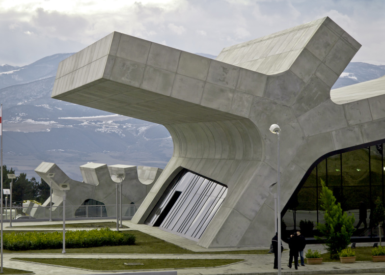
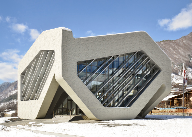
Architect Jürgen Mayer-Hermann was invited to Georgia's capital, Tbilisi, in 2004 after the country's recently elected president, Mikheil Saakashvili, saw his work in a book. Saakashvili had decided to embark on a program of investment in infrastructure that Mayer-Hermann, in a Dezeen profile, likens to post-war Germany. Over the next decade, Mayer-Hermann's practice — J. Mayer H. — went on to design a range of rest stops, border checkpoints, airports, and other public buildings for Saakashvili's government. Saakashvili is no longer president, but Dezeen says the buildings he commissioned will stand to show Georgia's rich history, rapid modernization, and connection to the west.

Image Source: www.theverge.com


I’m William B. Lauder, an architect from New York capturing the lines and shapes of city
structures, geometrically arranged for centuries.  Check out this Twitter page for more artistic adventures.